
The challenge
There are hundreds of credit cards on the market in the UK. Each one has a different set of potential benefits or pitfalls that people have to try and interpret. Jargon is common, while a strong understanding of what to look out for when deciding what to apply for is not common.
Credit Karma works with different lenders to figure out what kind of person they want to offer cards to, and based on what Credit Karma knows about people from their credit profile, Credit Karma can show how likely a person is to be approved for a particular card.
Here’s an early offer tile design, so you can get a sense of how they might look.

The approach
Since we were building a credit card marketplace from scratch, we recognised the opportunity to ‘do it better’ than all the other ways of getting a credit card in the UK.
We started by working out which card attributes to show by card type. For example, we recognised that balance transfer cards have a different hierarchy to rewards cards when it comes to deciding which one’s right for you.
Once we’d decided which attributes to show on each type of tile, it was time to tackle a problem our competitors had yet to successfully solve – how to explain how likely the user is to be approved and on what terms.
These two separate but connected problems have resulted in a lot of single-word explanations that aren’t easy to understand. Terms like ‘pre-approved’, ‘pre-qualified’ and ‘guaranteed’ are used interchangeably and I felt they didn’t do enough to explain exactly what the user is entering into.
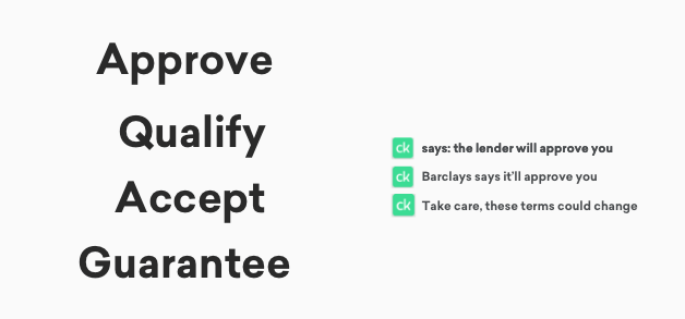
By applying for a ‘pre-approved’ card, all that’s really promised is that the user’s credit profile is a strong match for what the lender is looking for. To that end, it’s very likely the lender will accept them, but they’ll have to pass additional checks by the lender when they apply. And then, for many offers like this, lenders can choose to offer completely different rates if they want to.
What we did
We weren’t willing to settle for the industry standard, so we set about finding a way to describe the situation in a way that might make the most sense, without using any industry-speak.
In collaboration with my design colleagues, I settled on a percentage system to help people understand how likely they were to be approved. Thinking about how someone might explain this to a friend or relative, I settled on:
50-100% likely to be approved
This felt the least jargony and avoided gambling language like ‘odds of being approved’. However, it did have a shortcoming in that we would need to describe the top level of likelihood as ‘100% likely’ which could be a little confusing. As a team, we felt this was a risk worth taking to avoid jargon overall.
When it came to explaining that the rate you’d see might not be the rate you’d get, I settled on:
These rates might change / You’ll definitely get these rates
This felt direct and clear, especially when compared to the industry term ‘representative rates’, although we were careful to include a full explainer in a modal should people want further information.
Here’s the final result:
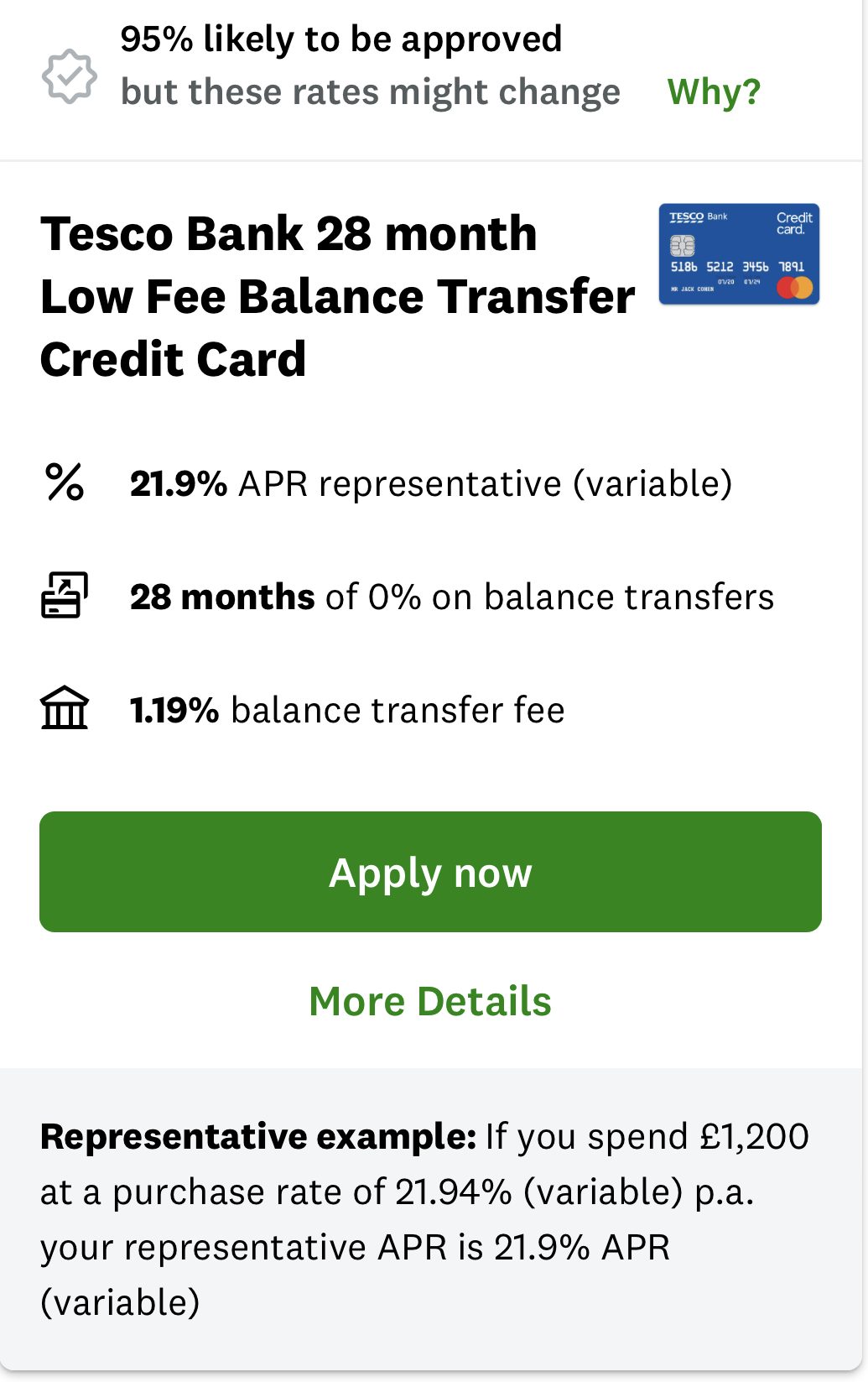
We positioned the ‘Why?’ link next to the uncertainty of the fact that ‘These rates might change’ so that users could learn more about this straight away, and hopefully support their shopping experience.
The outcome
I delivered a smart and simple content system to manage a complex content need, helping people shop more effectively for the right credit card.
Of course, with every system comes challenges, and we may now need to break the system to incorporate even more information into the smallest of spaces. The challenges never stop!
